
Myrelis Nieves
Data Analyst & AI Professional
ABOUT ME
Located in Western NYI build reliable systems that turn messy, real-world information into clear, actionable stories.My interest in data started at home: color-coded bill audits, subscription breakdowns, budget tracking, and watching every dollar closely enough to recognize patterns, plug leaks, and make calm, informed decisions. Over time, I realized that the same skills I used to bring order to my own household could also help businesses understand their numbers, improve their workflows, and make better decisions.Professionally, I focus on organizing, cleaning, and structuring information so it is easier to analyze, explain, and act on. I have experience with data cleaning, dashboards, Power BI, Excel, Google Sheets, SQL fundamentals, Tableau, and business data organization. I am also building my skills in AI operations and AI implementation, including prompt development, Google Gemini, responsible AI use, human-in-the-loop review, AI output evaluation, and workplace productivity tools.I care deeply about integrity, stewardship, and clarity. That means I do not just want to create reports that look good. I want to document how I move from raw data to final insight, double-check my work, and make sure the process is easy for someone else to follow. To me, good data should help people plan better, spend wisely, communicate clearly, and improve the way they operate.My background in customer-facing retail, print production, manufacturing, and early childhood education has taught me how real people and real businesses work. I have learned how to stay calm under pressure, explain confusing information in simple terms, troubleshoot messy files and processes, and create structure when things feel overwhelming.Today, I am growing into the space where data analytics, AI tools, and business operations meet. My goal is to help small businesses and teams use dashboards, organized systems, and AI-supported workflows to save time, reduce confusion, and make confident decisions.Outside of work, I am in Bible study, parenting mode, and serving in Sunday Children’s Ministry. I care about faith, family, generosity, joy, and building a life with purpose. The picture below is a reminder of why I am building: to grow, serve well, and create a better future for my children.

RESUME

Technical Portfolio Directory
A comprehensive collection of my analytical work, organized by core competency. Select a category below to view specific case studies and technical implementations using SQL, Power BI, Tableau, or R.
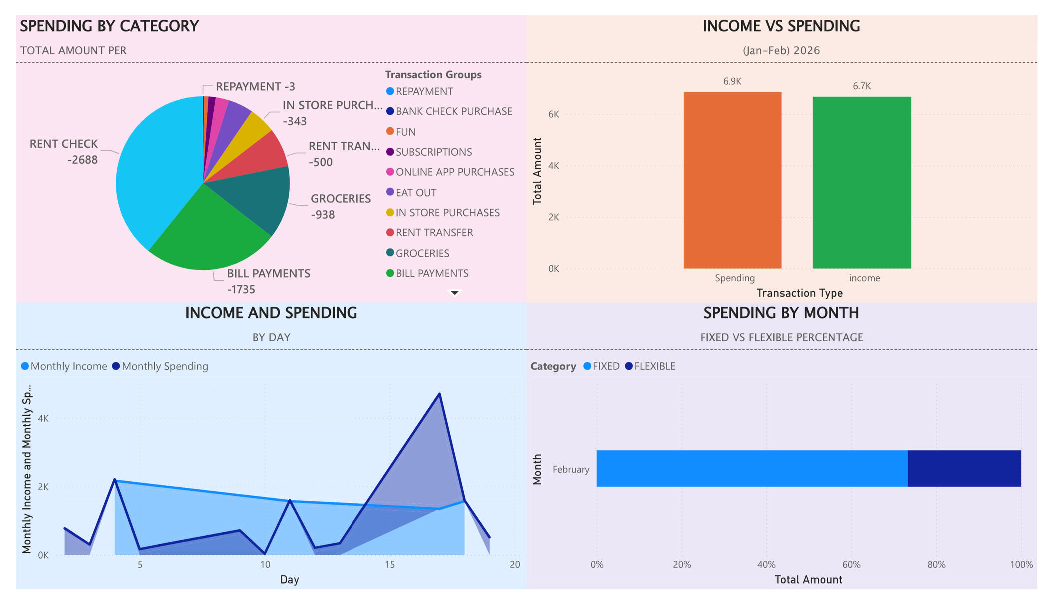
Power BI:
Business Intelligence &
Data Visualization
This gallery showcases my ability to transform raw data into actionable insights through interactive dashboards. These projects highlight my proficiency in building intuitive, user-centric reports that uncover trends and performance metrics
project 1
PROBLEM:
I wanted a clear baseline picture of client personal finances before they started using my bill binder system, so I could see exactly where the money was going in a “wild” month and have something to compare future progress against.WHAT I BUILT:
I built a one-page Power BI dashboard that shows: Spending by Category (pie chart), Income and Spending (bar chart), Income and Spending by Day (area chart), and Spending by Month split into Fixed vs Flexible ( stacked bar). The layout and formatting are designed to make the story of the month easy to read at a glanceTOOLS USED:
Power BI Desktop
Google Sheets/CSV bank export
Basic data cleaning and grouping in Power BIWHAT I LEARNED:
I learned how to import and model real bank data in Power BI, create multiple visuals that tell one consistent story, and use formatting (colors, labels,fixed vs flexible categories) to make financial patterns obvious. This project also gave me a ‘Baseline on account status’ i can use later to show behavior change over time.
contact
EMAIL: [email protected]
PHONE: 781-924-9034